
Where To Work Again?
Project Overview
Working for IBM, there are often opportunities to work in a variety of worldwide locations outside of your own home country. About 10 years ago I took an assignment to work and live for several years in the UK. That was a fascinating opportunity to work in and absorb a European culture. Now many of the opportunities are in what IBM refers to as "emerging markets", such as China, Singapore, India, and others.
While Europe was what I'd consider to be an "easy" place to work (not too dissimalar cultures from the US, English generally spoken, salary ranges comparable to the US), I'm wondering if an opportunity to work in one of the emerging markets would be viable.
Use the Stack Overflow data from 2017 from Kaggle as the basis for the examination per the rubric. The survey itself is pretty interesting and I will use this project as a foundation to examine the results with future results. I did find that Kaggle also has provides a good survey data tool that was very helpful in getting an intial view of the data.
Business Understanding
Here are the questions that I'm looking to answer in this project:
Main query topic: Should I stay in the US or should I go? I'll frame this as basically "Stay in the West" or "Go to the East"
- What is the salary difference between the West and the East?
- Any significant job satisfaction differences?
- What is the propensity to work remotely?
CRISP-DM
I'd also like to highlight in this blog a very useful method/process called CRISP-DM:
CRisp
Industry
Standard
Process
Data
Mining
I'll be making periodic references throughout.
Coming from an SPSS background, CRISP-DM has always been a cornerstone of SPSS development, particulary when using SPSS Modeler. This project follows the CRISP-DM process.
The SPSS Modeler view of CRISP-DM:

What do we have to work with?
For the curious, this is what I found from the Stack Overflow data:
- 7 Numeric
- 146 Categorical
- 1 Bool
Data Understanding (CRISP-DM Stage 2: Data Understanding)
A few thoughts:
1) For my analysis, I took a "low level" approach with python/numpy (head,tail,describe,shape,etc). Those can be very helpful tools for initial understanding, and usually the first place I investigate data from.
2) I like a python tool called "Pandas Profiling" as it provides a helpful summary as well is reflective of how I use python in my daily work. What I find valuable about this tool is that it provides a good level of initial data exploration, the depth of detail I want to see for each feature of data, as well as a good start at correlations and other related relationships.
Note on Salary
While there is a question in the survey that references currency used, in research how Stack Overflow handles the Salary field I found it's handy that they convert all salary values in terms of USD. https://insights.stackoverflow.com/survey/2019#methodology
As expected, there are also a few currency converters for Python https://www.geeksforgeeks.org/currency-converter-in-python/ https://pypi.org/project/CurrencyConverter/
A Second Note on Salary
Those that know this data set may understand that at least in the 2017 Survey, there are at least 75% of the Salary type questions unanswered. This was for Salary, Overpaid/Underpaid, and Expected Salary. I've covered this specifically in my Notebook, but the Cliff's Notes here is that I've used the Salary figures as data points. Albeit weak data points due to the low amount of data provided.
In the world of Data Science, there are long chapters in books and active debates on how to handle missing or absent data. For some types of data, one can "impute" values; looking at surrounding similar data and using statistics to come up with often accurate replacement data. In this case, imputing the salary fields would not be recommended due to 1) a small amount of surrounding data that exists to do the imputation, and 2) salary's can vary quite a bit from company to company.
So, with this caveat you'll still see some salary analysis just be aware that we're working with a very limited amount of salary data.
Question: Is there any correlation between job and career satisfaction?
Part of CRISP-DM is to looking to get an understanding of the data. I know that I have a 7 numeric fields that contain many of the fields that I'm interested in. This is just a broad brush view of these fields, I'm just looking to get a base understanding. I am interested in job and career satisfaction and looking at how they relate to each other as well as to the other numeric variables. One thing that becomes apparent though, is that I need to start breaking down my data into the countries that I select to represent the "East" and the "West".
So I left this analysis in as a first step of understanding, but I know that I need to dig deeper.
More Data Understanding
As seen in my Notebook, I created a series of bar charts looking at variables that helped me to answer my 3 main busines questions as well as just looking for general topics of interest. This is indeed an interesting survey!
This is still part of the CRISP method; looking at your data to understand it from a high level. I know that shortly I'll be breaking this data down into the "East" vs. "West" comparisons, but these sorts of bar charts are easy to understand at a glance and often provide some key insights into data.
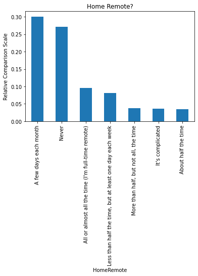
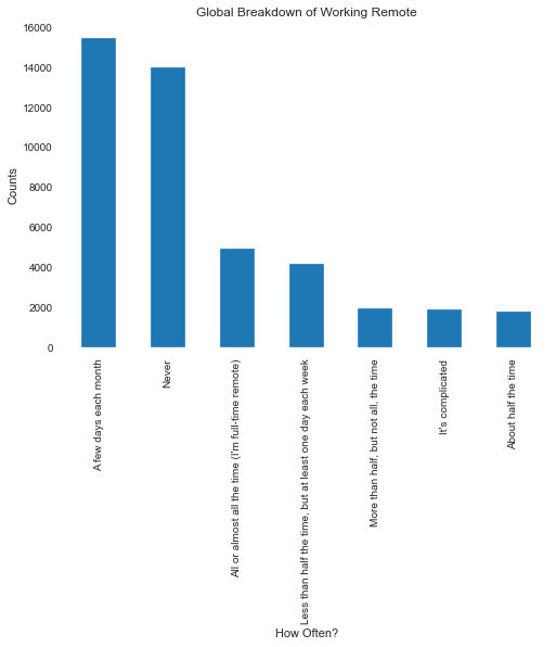
I'm also interested in the abilty to work and collaborate remotely. This is a key area for me for work in the US, and I would prioritize this in other countries. I've provided one of the bar charts here, and as mentioned you can see the full set in my Notebook.
Side Note: This will be an interesting chart to look at during and post Covid-19, since many companies that traditionally did NOT encourage and/or allow working remote had to quickly reframe that thinking.
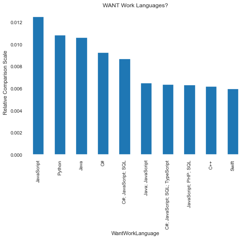
Interesting bar charts on coding languages
I suspect that most readers are interested in the what lanaguages folks want to work with. So the bar chart below...and again remember this is across all countries surveyed...shows JavaScript as the main language desired.
An interesting insight, as this would make me think that many of the folks being surveyed work in Web Design or at least are coding HTML scripts (where JavaScript is mainly used).
I'd have expected (and hoped) that the next language desired would be Python, and the data shows that is the case.
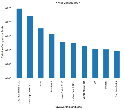
The second bar chart covering languages that folks HAVE worked in show JavaScript still a front runner. That Python is one of the trailing languages make sense since that is the time frame that Python was gaining more mainstream acceptance as Data Science was becoming more of a popular field.
Data Understanding Summary
I had a lot of bar charts, since they were both of interest to me as well as in general. A key item is that this survey has what I'd considered "a lot" of variables (152), but not too many that visually scanning data and getting a high level view has value.
As well, I'd found that I while I'm looking at Salary related information, I know that my sample size is much smaller than the data set as a whole. So I'd be looking at sites like "Glassdoor" and "LinkedIn" to get further details on salary as I was doing my due diligence on working in the East vs. West.
Next step will be Data Preparation. I know that I have a lot of categorical information that I need to segment into quantitative values for analysis, as well as do my East and West country breakdown.
Data preparation
CRISP-DM Stage 3: Prepare Data
For categorical variables "Country", I seperated them into three sectors: western, eastern and other.
While I'm primarily interested in "East" vs. "West", the I still want to keep the "Other" category for information value.
Here is a code snippet that shows how I broke down East and West countries. All remaining countries in the survey defaulted to "Other":
western = ['United States',  'Switzerland',
       'Iceland', 'Norway', 'Israel', 'Denmark',
       'Ireland', 'Canada', 'United Kingdom', 'Germany',
       'Netherlands', 'Sweden', 'Austria',
       'Finland', 'France', 'Belgium', 'Spain', 'Italy',
       'Poland']

eastern = ['Thailand', 'Singapore', 'Hong Kong',
       'South Korea', 'Japan', 'China',
       'Taiwan',  'India',
       'Indonesia', 'Vietnam']
Main Fields of interest.
These fields are the ones that I've chosen for my remaining analysis to answer the 3 business questions:
- Country: Country they are living
- YearsCodedJob: Years they are coding
- EmploymentStatus: Their employment status
- Salary: Their Salary
- JobSatisfaction & CareerSatisfaction: Are their satisfy their job and career
- Overpaid: How they think about their salary
I also wanted to have a breakdown by Years individuals were coding, since I'm interested in the maturity levels of companies and the regions of interet
Review Findings
CRISP-DM Stage 4/5: Model Data and Results
Now to review our findings after Data Preparation...
A helpful thought about survey data. A single years survey data is a snapshot of results, so "modeling" may mean different things to different individuals. I used Explanatory Modeling the in my Data Preparation and Modeling. This is as opposed to Predictive modeling. Nothing wrong with Predictive Modeling, but basic statistical analysis, EDA, and something as simple as a bar graph can go a long way in getting a point across. As well, my 3 business questions are pretty straighforward.
But Predictive Modeling certainly has a place in survey analysis. For example, I could use Predictive Modeling to analyze trends across a series of ages: "How does age relate to job satisfaction in countries that have a larger vs. smaller number of hours worked per week?". I will likely covered questions like that in my next blog post (aka "Capstone Project).
Also, Sentiment and Classification models work very well for Predictive Models and subsequent analysis. See the references at the end of this post.
Now on to the various visuals and analysis I did to answer my 3 business questions:
- What is the salary difference between the West and the East?
- Any significant job satisfaction differences?
- What is the propensity to work remotely?
An old favorite: Correlation Analysis
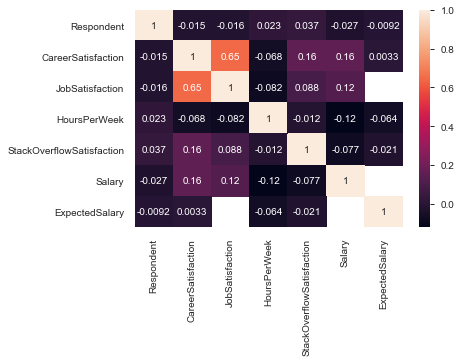
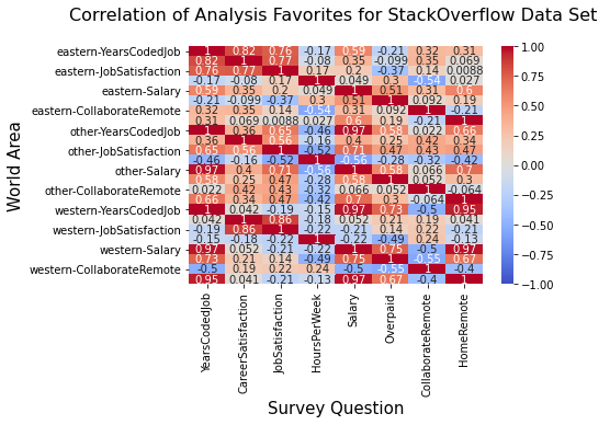
Here is a heatmap that shows correlations broken down by East, West, and Other. The red spectrum means stronger correlations, and the blue spectrum means weaker correlations. Not much of a surprise that there are strong correlations in both the East and West between Job and Career Satisfaction. It's good that there is a breakdown between these two areas, since Job Satisfaction can be affected by changing jobs, learning new and often related skills (Python vs. JavaScript), making more money. Career Satisfaction is something that often influences bigger life changes, such as changing careers completely.
Remember Salary is a weak data point due to sample size, but that said I was a bit surprised with the low correlations between Job Satisfaction and Salary. But only a bit, as I'd heard Salary in general referred to as a "Satis-ficer". Meaning salary, once a certain sufficient level is achieved, provides less satisfaction.
I did want to investigate further into Collaborate Remote as well, again lower correlations that I'd like to see. It appears that it's more imporant in the West than the East, but still it's a low number for both.
Salary Analysis
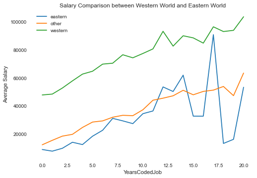
Yet again, I emphasize this is a small sample relative to the full survey. That said, it's pretty obvious the salary levels in the west are higher in the east across all experience levels.
Nothing in the data called out specifically an easy explanation for the drop, then rise of Salaries in the East for the more experience individuals. For a further step, I could reduce the sample set even more by looking to cull out the "outliers" for those years. But then again, those are possibly important trends to be aware of. I would also look at other salary data, and/or possibly a different year StackOverflow survey to see if this is similar there.
Are you overpaid or underpaid?
I thought this would also be a useful analysis. In general, those in the West see themselves as trending towards overpaid. I'm not sure what the significance of the big drop after 12.5 years to greatly underpaid, unless there is an age bias in the Eastern Countries. However, that theory is a little weak with the sudden rise to overpaid at 15 years or greater.
Overpaid/underpaid is still a pretty subjective category. What would have been helpful is to have a metric that held the industry averages for each country to compare against. For my purposes, this analysis tells me that the survey respondents in the east generally feel more underpaid than those in the west.
As a reminder, here is the map I used to map values to the Overpaid survey question:
overpaid_map = {
    'Greatly underpaid' : 1,
    'Somewhat underpaid' : 2,
    'Neither underpaid nor overpaid' : 3,
    'Somewhat overpaid' : 4,
    'Greatly overpaid' : 5,
    np.nan: np.nan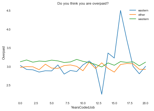
Collaborate Remote and Work Remote
I feel these are a key areas, both from a personal interest as well as overall industry trend and now in the current/post Covid world a necessity. Keep in mind the question asked here from the survey is "It's harder to collaborate with remote peers than those on site?". So this is a subjective assessment; for further evaluation Sentiment Analysis would be good here.
Again, it's important to remember how the questions are phrased:
- Collaborate Remote: "It's harder to collaborate with remote peers than those on site"
- Home Remote: "How often do you work from home or remotely?"
The first is subjective, the second quantitative.
For analysis, Collaborate Remote is mapped as:
- Strongly disagree: 1,
- Somewhat agree: 2,
- Agree: 3,
- Disagree: 4,
- Strongly agree: 5
And Work Remote is mapped as:
- Never: 1,
- Less than half the time, but at least one day each week: 2,
- A few days each month: 3,
- About half the time: 4,
- More than half, but not all, the time: 5,
- It's complicated: 6,
- All or almost all the time (I'm full-time remote): 7
Arguably, "It's complicated" could have been dropped from the analysis, but there were a small number of them so I kept them in.
Following are a series of visuals produced that show various relationship between Collaborate Remote, Work Remote (the Home Remote variable), and Job Satisfaction:
Working remote in 2017 was not a significant amount.
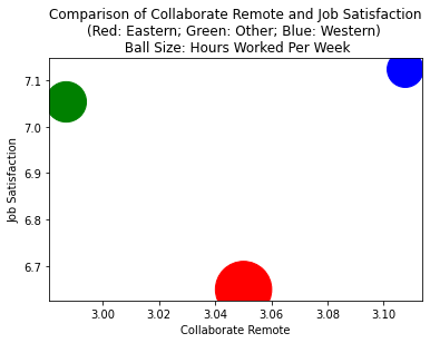
For the East, job satisfaction is lower than the West, however the East skews more towards finding it easier to collaborate remote.
Ball size here indicates average hours per week higher in the East, possibly an downward influence on the Job satisfaction.
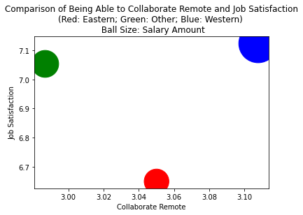
Ball size here indicates salary lower in the East, another potential downward influence on the Job satisfaction.
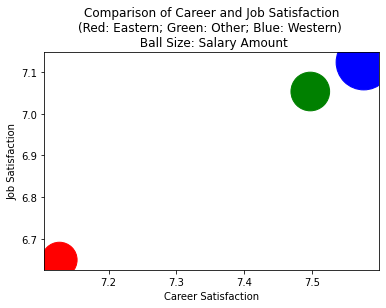
Career vs. Job Satisfaction
Here, we can see that western programmers (blue ball) have a much higher satisfaction on their job and career, positioned at the right-high-up corner. The ball size indicator their average salary, the blue ball size is much larger than the red ball (eastern programmers salary).
Conclusion
CRISP-DM Stage 5: Evaluation/Deployment
- Across the range of age brackets, the salary levels reported for "Eastern" vs. "Western" countries (as defined by myself) were lower.
- There was a big drop after 12.5 years to greatly
underpaid, that could possibly indicate an age bias in
the Eastern Countries. However, that theory is a
little weak with the sudden rise to overpaid at 15
years or greater. There would be two ways to treat
this:
- Remove those low values
- Investigate further; however this would require finding data beyond this survey data
- As well, Job Satisfaction and Career Satisfaction are higher for those in the "Western" countries vs "Eastern". This would be an area that would be worth investigating further, looking for anecdotal data from sites such as Glassdoor, LinkedIn, etc. As well, interviewing in those countries should include questions that cover this topic as well.
- It's worth looking at the types of Machine Learning and Statistical Models to be used with Survey and other subjective data and looking closely at how the categorical data is translated to quantitative measures for analysis. Further analysis via Sentiment would also be a good area to review.
Deployment is this blog post. :-) My github page provides more analysis in the Notebook as well as documenting the analysis research.
Final Thoughts
This data is valuable in evaluating in looking at a position working in the East or West. For my situation, as working in the US, I would be inclined to do more due diligence in researching an opportunity in the East. I'd also expect to be working in general more hours in the East, and I would also be insure to look closely at a potential employer and their view toward working remote.
Also, survey development and analysis is a fascinating field unto itself! I would recommend looking at the StackOverflow analysis of their 2017 survey here: https://insights.stackoverflow.com/survey/2017
References
Note: I was torn between doing a Covid-19 study with this data looking at potential COBOL programmers (since there is a shortage of COBOL programmers) and the West/East comparison. In the end as relevant as the COBOL study would have been, I decided on West vs. East since I still am considerating a position in one of the emerging markets.
This was a helpful overview POV of writing a Blog Posting: https://medium.com/@AbdulazizKTA/write-a-data-science-blog-post-f8c5e1ece761
While I didn't end up using much from here, this is a great recap of Andrew Ng's ML class from Stanford: https://drive.google.com/file/d/1TgcLh0XzkFioN9vd7xwLzsKp2pHMKd8_/view
Covid-19 Projects on Kaggle: https://www.kaggle.com/covid19
This is a classic, and helpful in putting together a Data Science Blog Post: https://www.kaggle.com/c/titanic
Good info here on Data Science Blog Posts, and a good section on Git integration: https://www.dataquest.io/blog/how-to-setup-a-data-science-blog/
Hindsight is 20-20! It's instructive and informative to see the overall analysis that Stack Overflow does themselves on their survey data: https://insights.stackoverflow.com/survey/2017
I'm using the CRISP-DM framework from our lesson 1 as well as an SPSS link provided around CRISP-DM
A helpful thought about survey data. A single years survey data is a snapshot of results, so "modeling" may mean different things to different individuals. I liked this article on Explanatory vs. Predictive modeling. So much of what I see in my workday is around Predicitive model..."show me the future" thinking. Nothing wrong with that, but basic statistical analysis, EDA, and something as simple as a bar graph can go a long way in getting a point across. See: https://www.surveypractice.org/article/2718-an-introduction-to-machine-learning-methods-for-survey-researchers
That said, modeling such as classification with survey data is a great technique. The folks at Survey Monkey have some ideas here: https://monkeylearn.com/blog/survey-analysis/#what-is-aspect-based-sentiment-analysis
Coming from SPSS, I've found that Sentiment Analysis is a very powerful and a common way to analyze data. There are a variety of automated/expert models in SPSS around sentiment and classification, and KDnuggets here provides a good overview as well: https://www.kdnuggets.com/2018/03/5-things-sentiment-analysis-classification.html